Welcome!

By registering with us, you'll be able to discuss, share and private message with other members of our community.

SignUp Now!

Прикольные префиксы

Ушёл
Мар
1,178
3,023
Активный
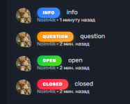
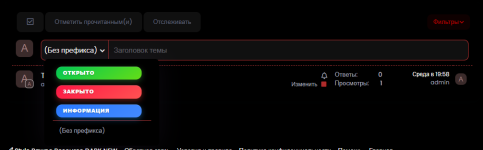
Приветствую всех! Сегодня я подготовил интересные префиксы для вашего форума.
CSS:
.open {
    background: linear-gradient(145deg, #00c853, #64dd17);
    border: none;
    border-radius: 12px;
    padding: 6px 14px;
    font-size: 11px;
    font-weight: 800;
    text-transform: uppercase;
    margin-right: 12px;
    color: #fff;
    box-shadow: 0 4px 12px rgba(76, 175, 80, 0.4),
                inset 0 1px 0 rgba(255, 255, 255, 0.2);
    text-shadow: 0 1px 2px rgba(0, 0, 0, 0.3);
    letter-spacing: 0.5px;
    position: relative;
    overflow: hidden;
    transition: all 0.3s ease;
    
    &:hover {
        transform: translateY(-1px);
        box-shadow: 0 6px 16px rgba(76, 175, 80, 0.5),
                    inset 0 1px 0 rgba(255, 255, 255, 0.2);
    }
}

.closed {
    background: linear-gradient(145deg, #ff1744, #ff5252);
    border: none;
    border-radius: 12px;
    padding: 6px 14px;
    font-size: 11px;
    font-weight: 800;
    text-transform: uppercase;
    margin-right: 12px;
    color: #fff;
    box-shadow: 0 4px 12px rgba(244, 67, 54, 0.4),
                inset 0 1px 0 rgba(255, 255, 255, 0.2);
    text-shadow: 0 1px 2px rgba(0, 0, 0, 0.3);
    letter-spacing: 0.5px;
    position: relative;
    overflow: hidden;
    transition: all 0.3s ease;
    
    &:hover {
        transform: translateY(-1px);
        box-shadow: 0 6px 16px rgba(244, 67, 54, 0.5),
                    inset 0 1px 0 rgba(255, 255, 255, 0.2);
    }
}

.info {
    background: linear-gradient(145deg, #2979ff, #448aff);
    border: none;
    border-radius: 12px;
    padding: 6px 14px;
    font-size: 11px;
    font-weight: 800;
    text-transform: uppercase;
    margin-right: 12px;
    color: #fff;
    box-shadow: 0 4px 12px rgba(33, 150, 243, 0.4),
                inset 0 1px 0 rgba(255, 255, 255, 0.2);
    text-shadow: 0 1px 2px rgba(0, 0, 0, 0.3);
    letter-spacing: 0.5px;
    position: relative;
    overflow: hidden;
    transition: all 0.3s ease;
    
    &:hover {
        transform: translateY(-1px);
        box-shadow: 0 6px 16px rgba(33, 150, 243, 0.5),
                    inset 0 1px 0 rgba(255, 255, 255, 0.2);
    }
}

.question {
    background: linear-gradient(145deg, #ff9100, #ffab40);
    border: none;
    border-radius: 12px;
    padding: 6px 14px;
    font-size: 11px;
    font-weight: 800;
    text-transform: uppercase;
    margin-right: 12px;
    color: #fff;
    box-shadow: 0 4px 12px rgba(255, 152, 0, 0.4),
                inset 0 1px 0 rgba(255, 255, 255, 0.2);
    text-shadow: 0 1px 2px rgba(0, 0, 0, 0.3);
    letter-spacing: 0.5px;
    position: relative;
    overflow: hidden;
    transition: all 0.3s ease;
    
    &:hover {
        transform: translateY(-1px);
        box-shadow: 0 6px 16px rgba(255, 152, 0, 0.5),
                    inset 0 1px 0 rgba(255, 255, 255, 0.2);
    }
}
1760199613886.png
 
Лучше плохо начать, чем хорошо бездействовать
Ноя
2,716
2,839
Профессионал
Приветствую всех! Сегодня я подготовил интересные префиксы для вашего форума.
CSS:
.open {
    background: linear-gradient(145deg, #00c853, #64dd17);
    border: none;
    border-radius: 12px;
    padding: 6px 14px;
    font-size: 11px;
    font-weight: 800;
    text-transform: uppercase;
    margin-right: 12px;
    color: #fff;
    box-shadow: 0 4px 12px rgba(76, 175, 80, 0.4),
                inset 0 1px 0 rgba(255, 255, 255, 0.2);
    text-shadow: 0 1px 2px rgba(0, 0, 0, 0.3);
    letter-spacing: 0.5px;
    position: relative;
    overflow: hidden;
    transition: all 0.3s ease;
   
    &:hover {
        transform: translateY(-1px);
        box-shadow: 0 6px 16px rgba(76, 175, 80, 0.5),
                    inset 0 1px 0 rgba(255, 255, 255, 0.2);
    }
}

.closed {
    background: linear-gradient(145deg, #ff1744, #ff5252);
    border: none;
    border-radius: 12px;
    padding: 6px 14px;
    font-size: 11px;
    font-weight: 800;
    text-transform: uppercase;
    margin-right: 12px;
    color: #fff;
    box-shadow: 0 4px 12px rgba(244, 67, 54, 0.4),
                inset 0 1px 0 rgba(255, 255, 255, 0.2);
    text-shadow: 0 1px 2px rgba(0, 0, 0, 0.3);
    letter-spacing: 0.5px;
    position: relative;
    overflow: hidden;
    transition: all 0.3s ease;
   
    &:hover {
        transform: translateY(-1px);
        box-shadow: 0 6px 16px rgba(244, 67, 54, 0.5),
                    inset 0 1px 0 rgba(255, 255, 255, 0.2);
    }
}

.info {
    background: linear-gradient(145deg, #2979ff, #448aff);
    border: none;
    border-radius: 12px;
    padding: 6px 14px;
    font-size: 11px;
    font-weight: 800;
    text-transform: uppercase;
    margin-right: 12px;
    color: #fff;
    box-shadow: 0 4px 12px rgba(33, 150, 243, 0.4),
                inset 0 1px 0 rgba(255, 255, 255, 0.2);
    text-shadow: 0 1px 2px rgba(0, 0, 0, 0.3);
    letter-spacing: 0.5px;
    position: relative;
    overflow: hidden;
    transition: all 0.3s ease;
   
    &:hover {
        transform: translateY(-1px);
        box-shadow: 0 6px 16px rgba(33, 150, 243, 0.5),
                    inset 0 1px 0 rgba(255, 255, 255, 0.2);
    }
}

.question {
    background: linear-gradient(145deg, #ff9100, #ffab40);
    border: none;
    border-radius: 12px;
    padding: 6px 14px;
    font-size: 11px;
    font-weight: 800;
    text-transform: uppercase;
    margin-right: 12px;
    color: #fff;
    box-shadow: 0 4px 12px rgba(255, 152, 0, 0.4),
                inset 0 1px 0 rgba(255, 255, 255, 0.2);
    text-shadow: 0 1px 2px rgba(0, 0, 0, 0.3);
    letter-spacing: 0.5px;
    position: relative;
    overflow: hidden;
    transition: all 0.3s ease;
   
    &:hover {
        transform: translateY(-1px);
        box-shadow: 0 6px 16px rgba(255, 152, 0, 0.5),
                    inset 0 1px 0 rgba(255, 255, 255, 0.2);
    }
}
Посмотреть вложение 13827
Базовые префиксы
 
Окт
203
303
Пользователь
Приветствую всех! Сегодня я подготовил интересные префиксы для вашего форума.
CSS:
.open {
    background: linear-gradient(145deg, #00c853, #64dd17);
    border: none;
    border-radius: 12px;
    padding: 6px 14px;
    font-size: 11px;
    font-weight: 800;
    text-transform: uppercase;
    margin-right: 12px;
    color: #fff;
    box-shadow: 0 4px 12px rgba(76, 175, 80, 0.4),
                inset 0 1px 0 rgba(255, 255, 255, 0.2);
    text-shadow: 0 1px 2px rgba(0, 0, 0, 0.3);
    letter-spacing: 0.5px;
    position: relative;
    overflow: hidden;
    transition: all 0.3s ease;
   
    &:hover {
        transform: translateY(-1px);
        box-shadow: 0 6px 16px rgba(76, 175, 80, 0.5),
                    inset 0 1px 0 rgba(255, 255, 255, 0.2);
    }
}

.closed {
    background: linear-gradient(145deg, #ff1744, #ff5252);
    border: none;
    border-radius: 12px;
    padding: 6px 14px;
    font-size: 11px;
    font-weight: 800;
    text-transform: uppercase;
    margin-right: 12px;
    color: #fff;
    box-shadow: 0 4px 12px rgba(244, 67, 54, 0.4),
                inset 0 1px 0 rgba(255, 255, 255, 0.2);
    text-shadow: 0 1px 2px rgba(0, 0, 0, 0.3);
    letter-spacing: 0.5px;
    position: relative;
    overflow: hidden;
    transition: all 0.3s ease;
   
    &:hover {
        transform: translateY(-1px);
        box-shadow: 0 6px 16px rgba(244, 67, 54, 0.5),
                    inset 0 1px 0 rgba(255, 255, 255, 0.2);
    }
}

.info {
    background: linear-gradient(145deg, #2979ff, #448aff);
    border: none;
    border-radius: 12px;
    padding: 6px 14px;
    font-size: 11px;
    font-weight: 800;
    text-transform: uppercase;
    margin-right: 12px;
    color: #fff;
    box-shadow: 0 4px 12px rgba(33, 150, 243, 0.4),
                inset 0 1px 0 rgba(255, 255, 255, 0.2);
    text-shadow: 0 1px 2px rgba(0, 0, 0, 0.3);
    letter-spacing: 0.5px;
    position: relative;
    overflow: hidden;
    transition: all 0.3s ease;
   
    &:hover {
        transform: translateY(-1px);
        box-shadow: 0 6px 16px rgba(33, 150, 243, 0.5),
                    inset 0 1px 0 rgba(255, 255, 255, 0.2);
    }
}

.question {
    background: linear-gradient(145deg, #ff9100, #ffab40);
    border: none;
    border-radius: 12px;
    padding: 6px 14px;
    font-size: 11px;
    font-weight: 800;
    text-transform: uppercase;
    margin-right: 12px;
    color: #fff;
    box-shadow: 0 4px 12px rgba(255, 152, 0, 0.4),
                inset 0 1px 0 rgba(255, 255, 255, 0.2);
    text-shadow: 0 1px 2px rgba(0, 0, 0, 0.3);
    letter-spacing: 0.5px;
    position: relative;
    overflow: hidden;
    transition: all 0.3s ease;
   
    &:hover {
        transform: translateY(-1px);
        box-shadow: 0 6px 16px rgba(255, 152, 0, 0.5),
                    inset 0 1px 0 rgba(255, 255, 255, 0.2);
    }
}
Посмотреть вложение 13827
Выглядит прикольно, мне нравится)
 
❤️Птиц❤️ • Делай людям добро - оно вернётся
Авг
633
1,253
Активный
Выглядят классно. Для базового форума пойдёт!
 
Сверху